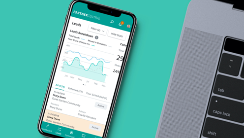
A Place for Mom needed the partner senior communities to have an easy experience adding and updating listing information. I sat down with various community managers who used the old version of Partner Central to hear what feedback they had. The conversations were insightful and productive, and I put the feedback into a new, fresh app designed for both the web and for phones.
HATS WORN: Project Management, UX/UI Design, Concepting, Wireframing, Information architecture, Copywriting, Prototyping, UX research, Visual Design, User studies, AB testing
DELIVERABLES: Digital Product
UNDERSTAND
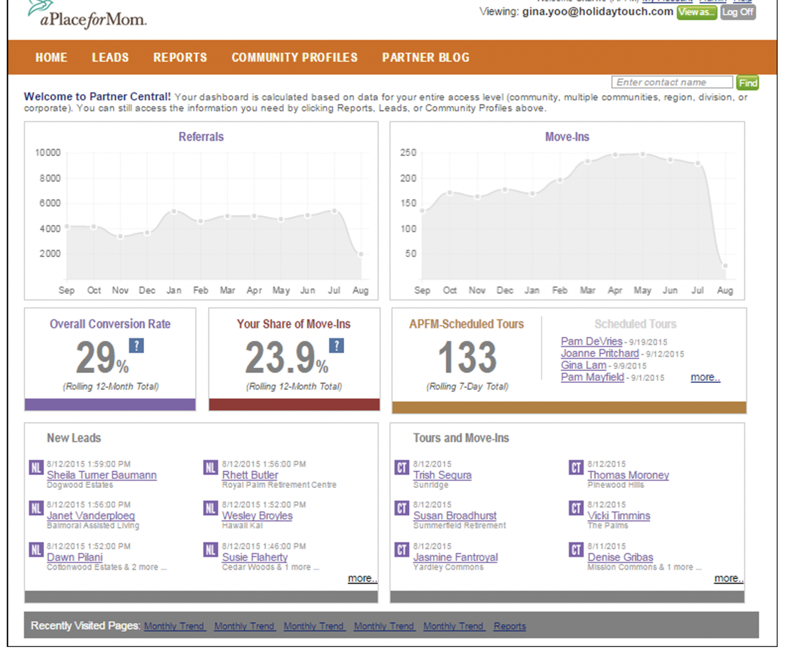
I reviewed all the materials, studied the project goals and how APFM was currently providing this product to the customers. I researched analytics and reviewed all the information I was provided with. I also sat down with various community managers who used the old version of Partner Central to hear what feedback they had. I then sat down with our developers to get a holistic understanding of the old portal, its limitations and scalability.
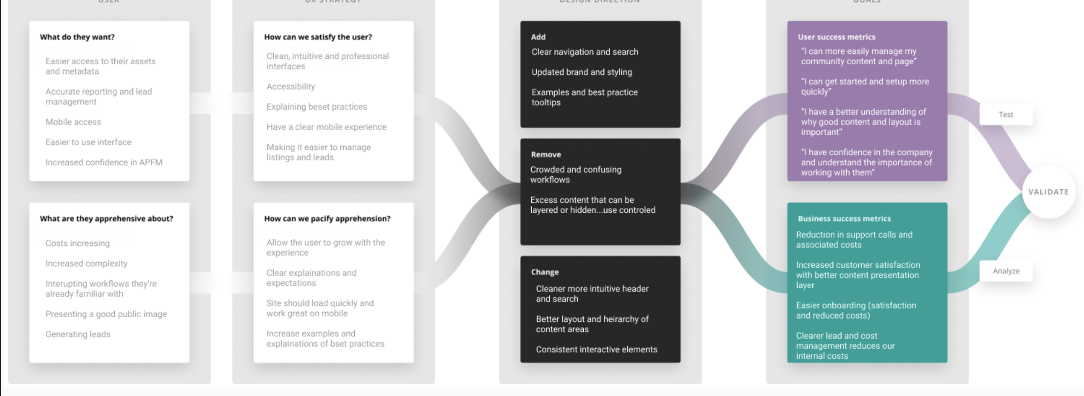
DESIGN CANVAS
Once I felt I had a good understanding of the materials I was given and the research I had done, I was able to write up a design canvas. The design canvas was a tool that helped me to stay customer focused because it was concise, to the point and outlined the objectives and goals. The design canvas included taking a deep dive into the user; what they want, how we can satisfy the user, what they are apprehensive about and how we can pacify the apprehension. With that, the focus was on the design direction specifying what I will add, remove and change. With these steps I was able to craft the user and business goals.
RESEARCH
It was very enlightening to hear what the users had to say about an existing product. The feedback was very helpful in identifying core opportunities for improvement. With that information I was able to unify all the stakeholders with the input from the third party. It was also important at this point to do market research and explore competitors or similar players that provide ideas on both good and bad approaches.
CORE OPPORTUNITIES INCLUDED:
PROBLEM SOLVE AND COMPILE INSPIRATION
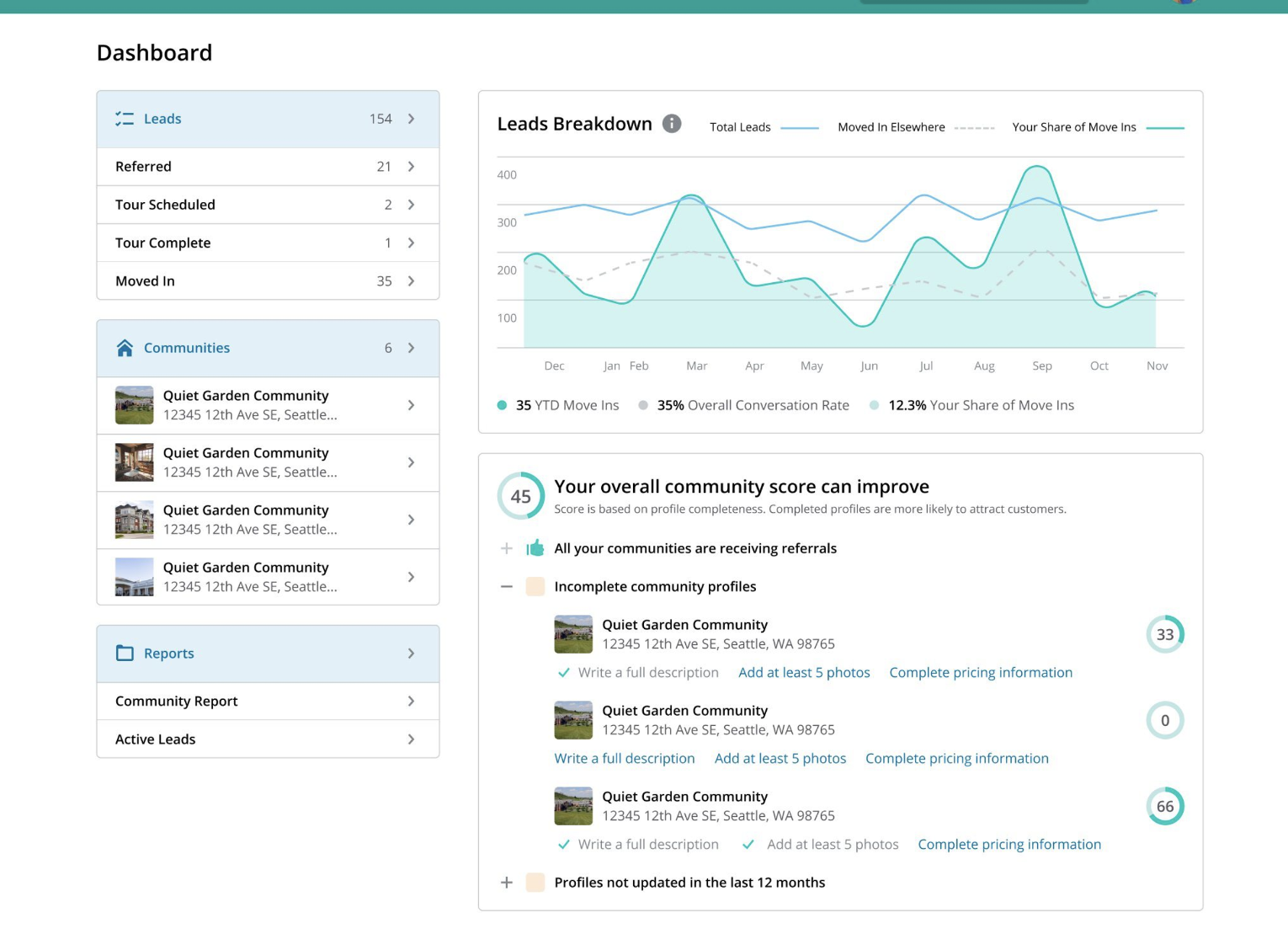
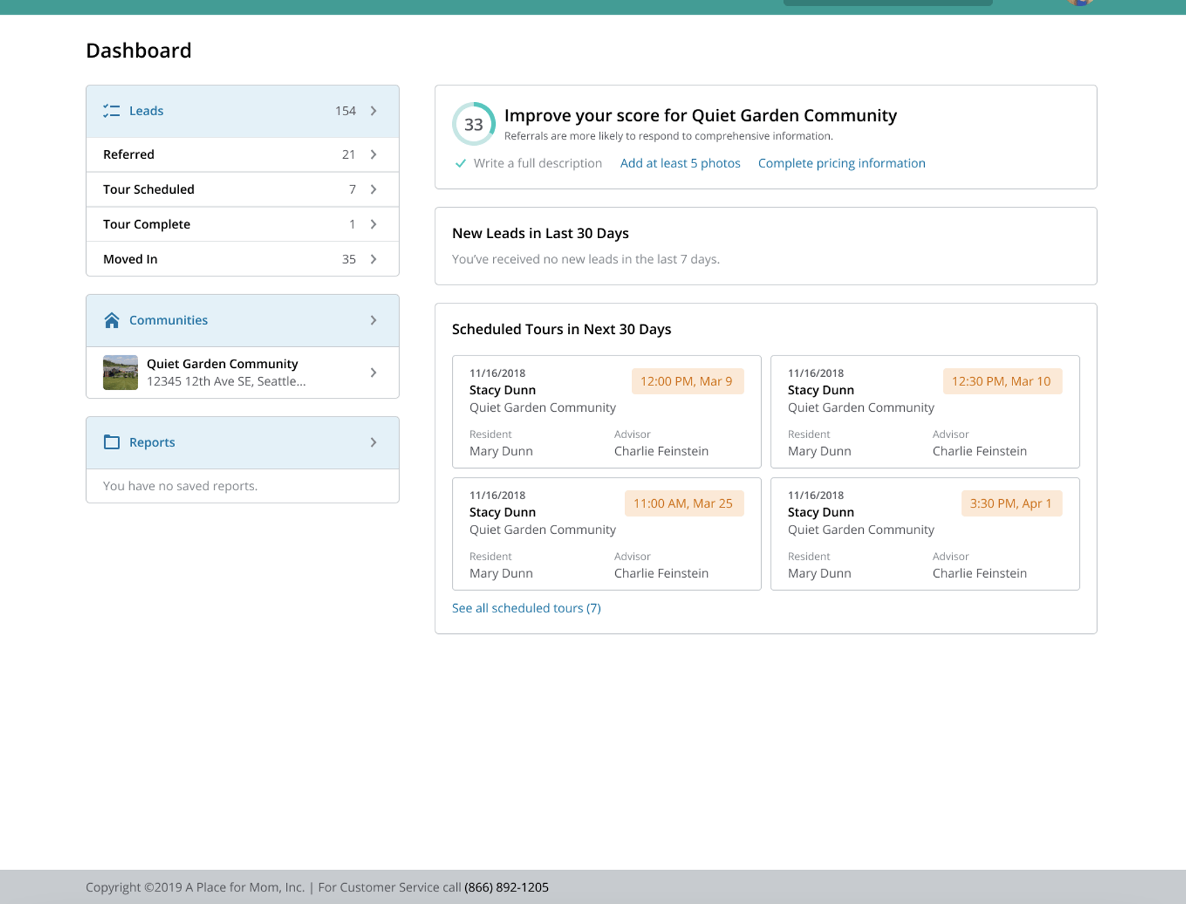
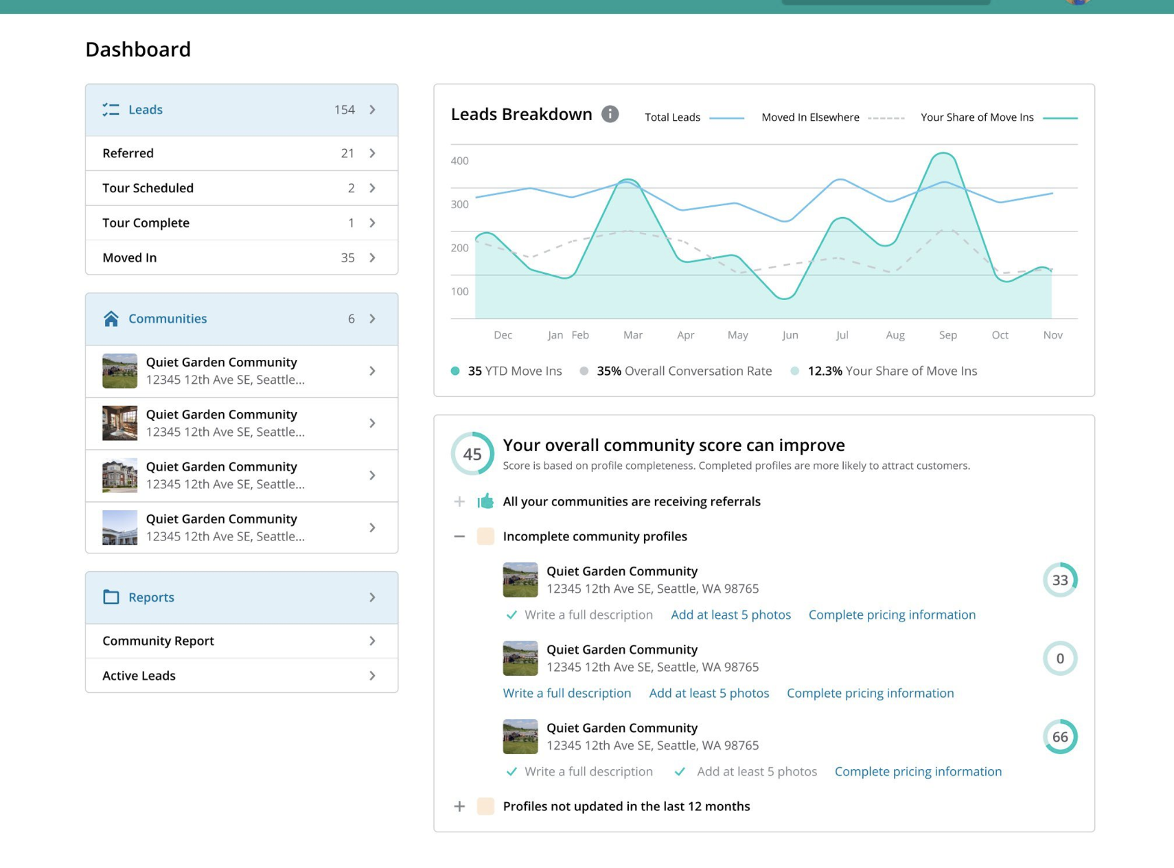
I went through countless ideas and designs to find a handful of examples that felt really on point for the project, which was fun. Problem solving for getting users to update their profile was the biggest challenge. My solution was to score the community profiles with the goal to encourage managers to fill in adequate information for customers. This was a new feature. Once I scoped how the profiles were scored, I sat down with the tech team to turn that vision into a reality. With that and other ideas on the table, all the stakeholders aligned on what to move forward with and work in.
SKETCH THEN WIREFRAME
I wireframed layouts; I tried a lot of things and failed fast which helps me filter a winner. This step also included writing up the sitemap and information architecture.
DESIGN AND BUILD
It was finally time to turn to Figma and create visual layouts now that I had a holistic understanding of the project.
REVIEW ACCESSIBILITY
As the designer, I feel an obligation to provide a product that can be used by people regardless of physical capabilities. At this point, I check my work with my design standards.
DESIGN STANDARDS INCLUDE:
OPTIMIZE:
With weekly reviews and updates on the project, I was able to optimize the product and meet hard deadlines. Using clear communication, strict processes and complete transparency with my team I was able to make the most effective use of my skills.
VALIDATE
Once the designs and prototypes were complete, I went through a cycle of tests to see if the pain points discovered in the user research phase had been reconciled.
SINGAL COMMUNITY DASHBOARD
MULTIPLE COMMUNITY DASHBOARD
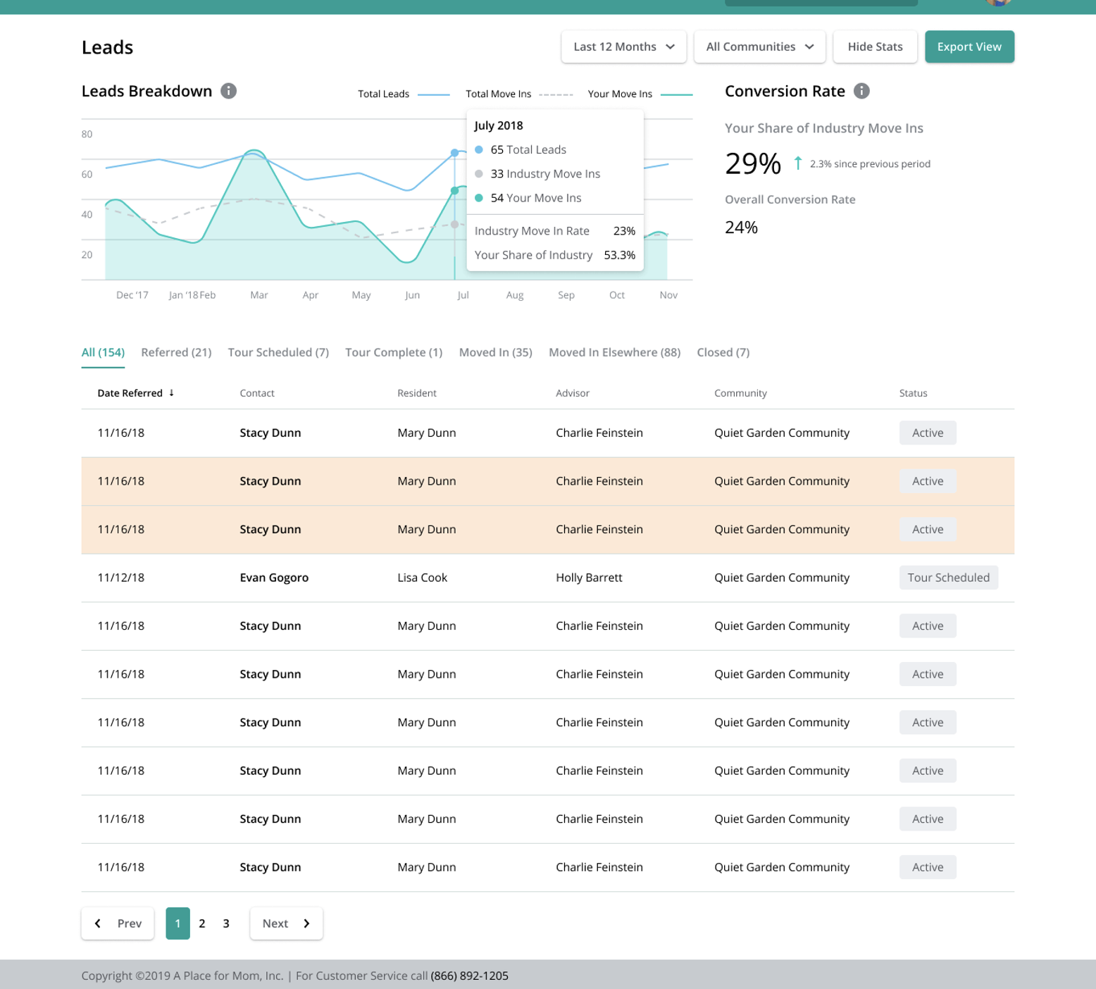
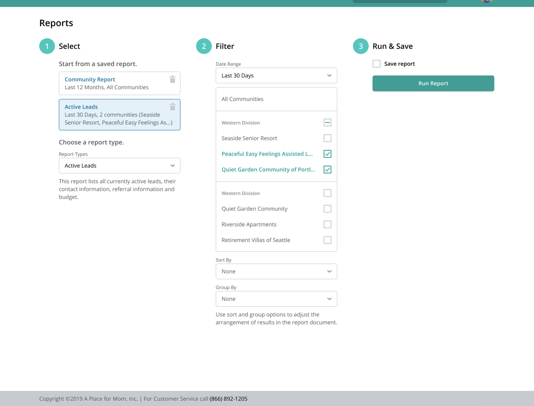
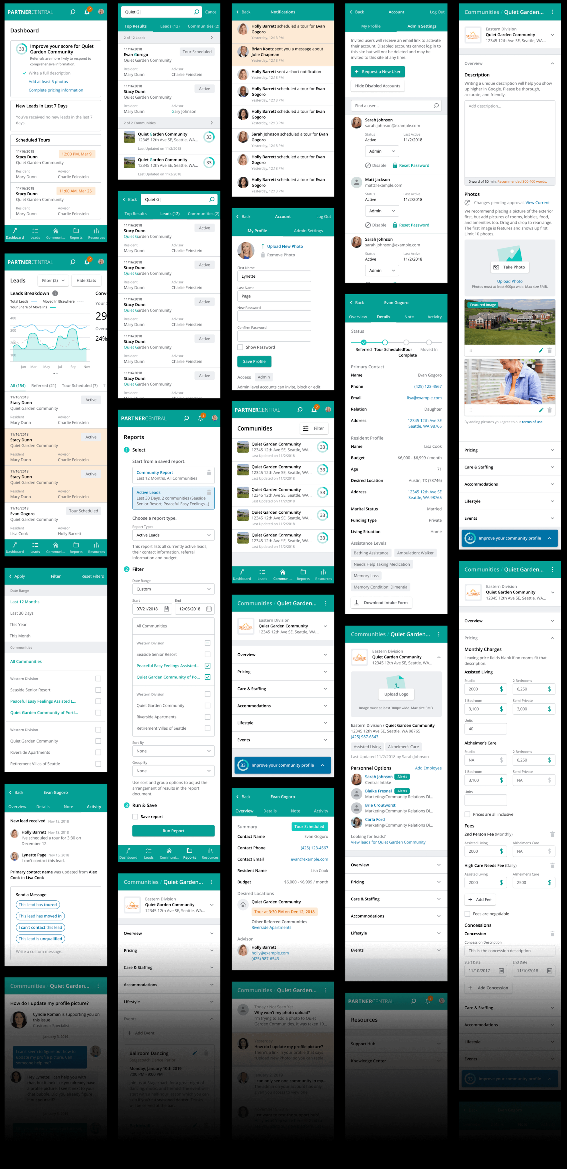
The users wanted to be able to read their reports or run reports and have the results be easy to understand. To do this I kept in mind spacing and positioning of elements which made a huge difference in the users ability to navigate and understand the content. By breaking up the content with the use of color and line textures, I was able to combine the information on one graph. The users also had the ability to filter how they wanted to view their stats or engage with their leads through the tabs navigation.
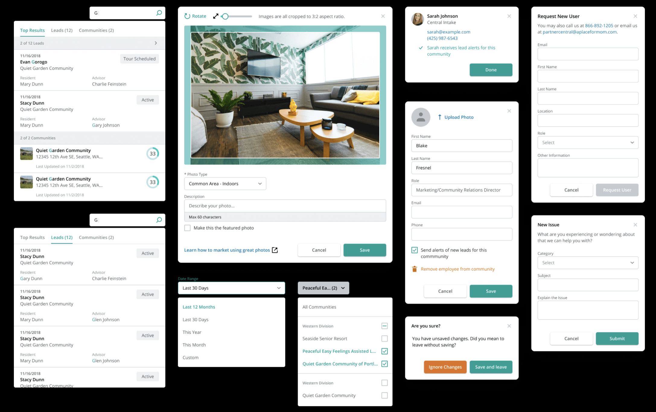
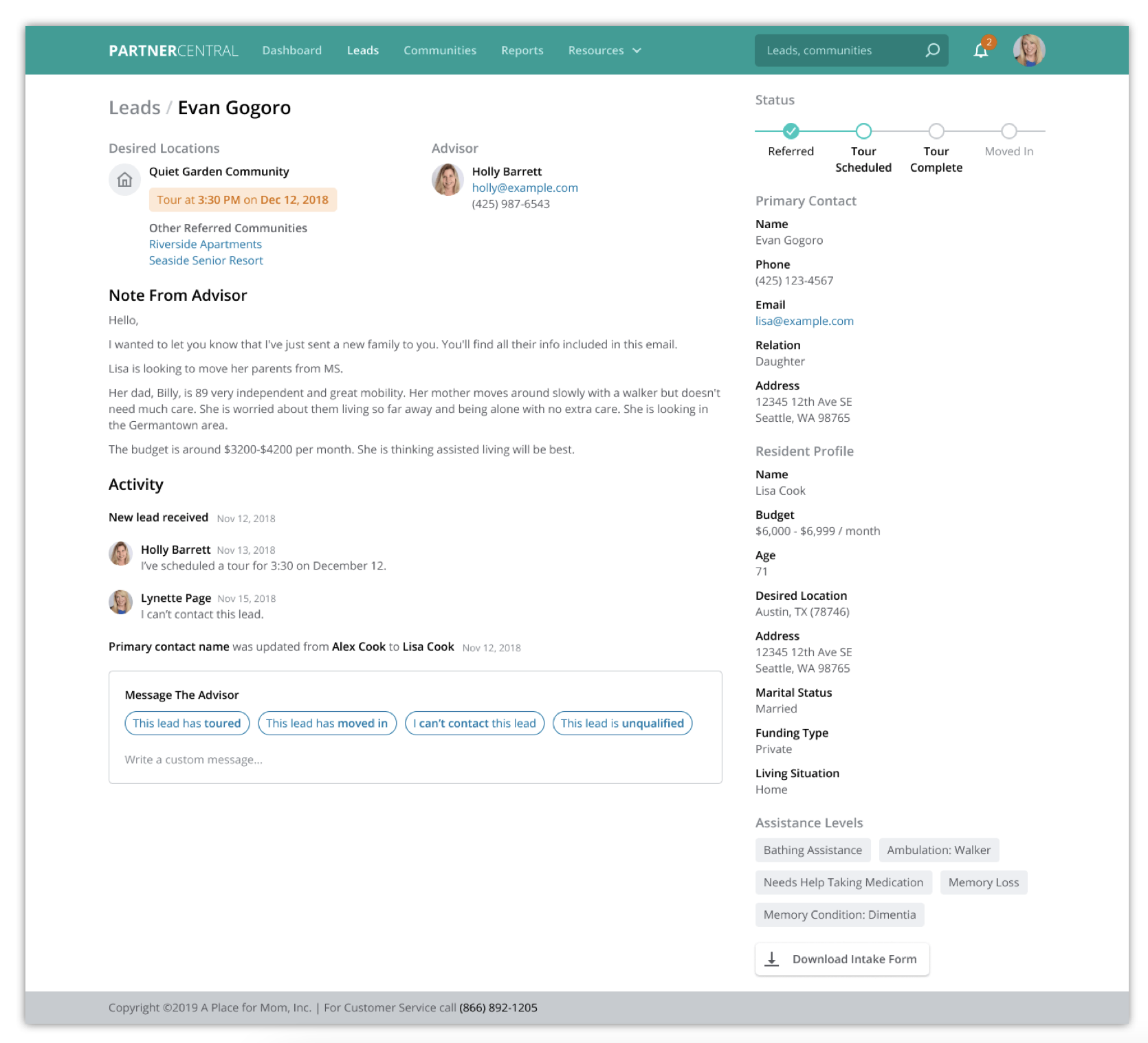
APFM’s marketing capabilities deliver a reliable and continuous stream of high-quality referrals to partner communities to meet their occupancy goals in an increasingly competitive market. The lead details page allows partners to quickly access information about all their referrals while sharing feedback and updates with their referring advisors. On the leads detail page, partners get introduced to new families already prepped with valuable information about the families, and in turn help increase overall move-ins and conversion rates.
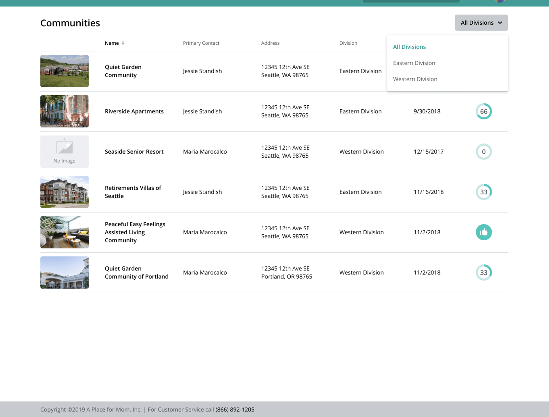
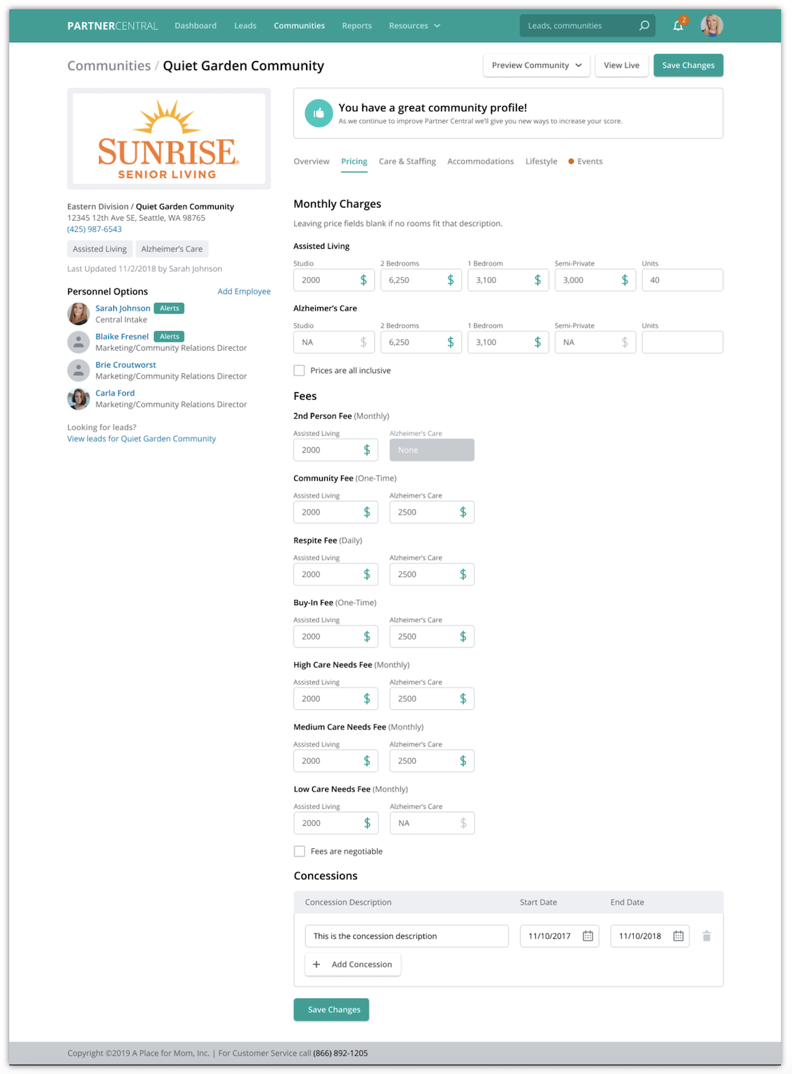
COMMUNITY MANAGEMENT PAGE
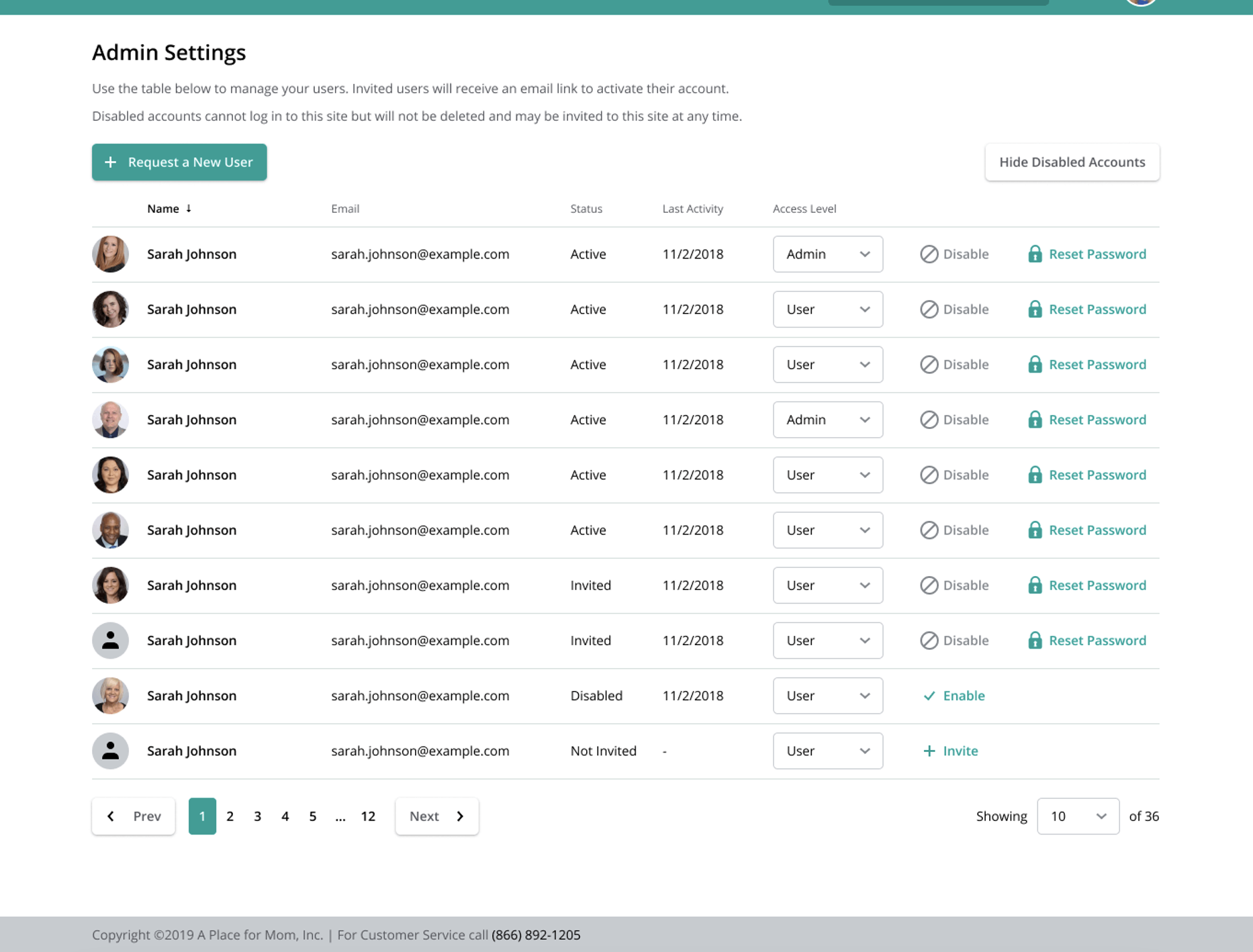
ADMIN SETTINGS PAGE
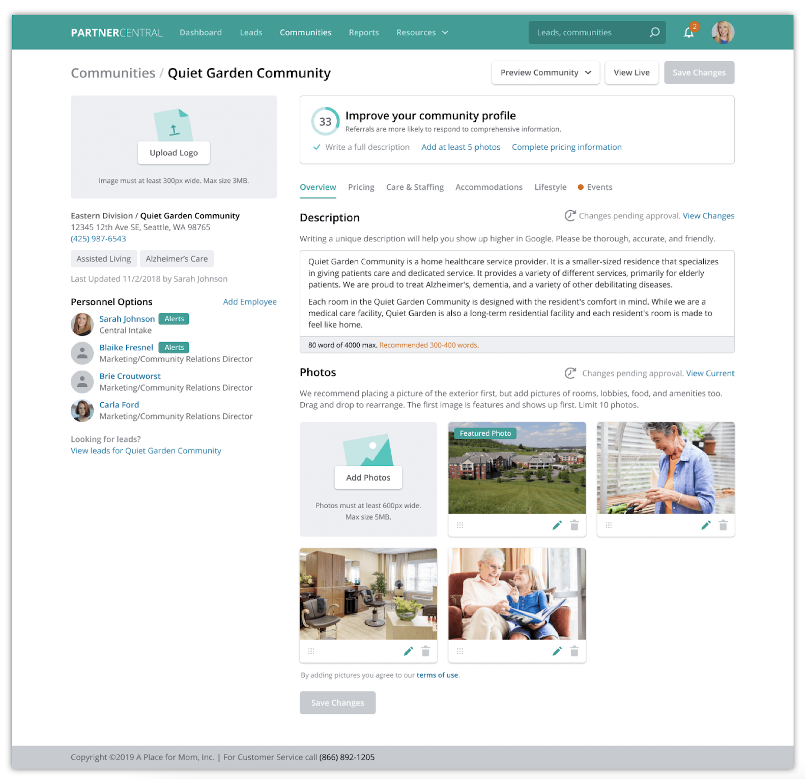
Problem solving for getting users to update their profile was the biggest challenge. Our main goal was to encourage managers to fill in adequate information for customers. After many iterations of sketches, research, and white boarding, my solution was to create visual queues and content to encourage the users to make the best profile possible. The visual queue was a score circle supported by content tips such as “Score is based on your profiles completeness. Complete profiles are more likely to attract customers.”
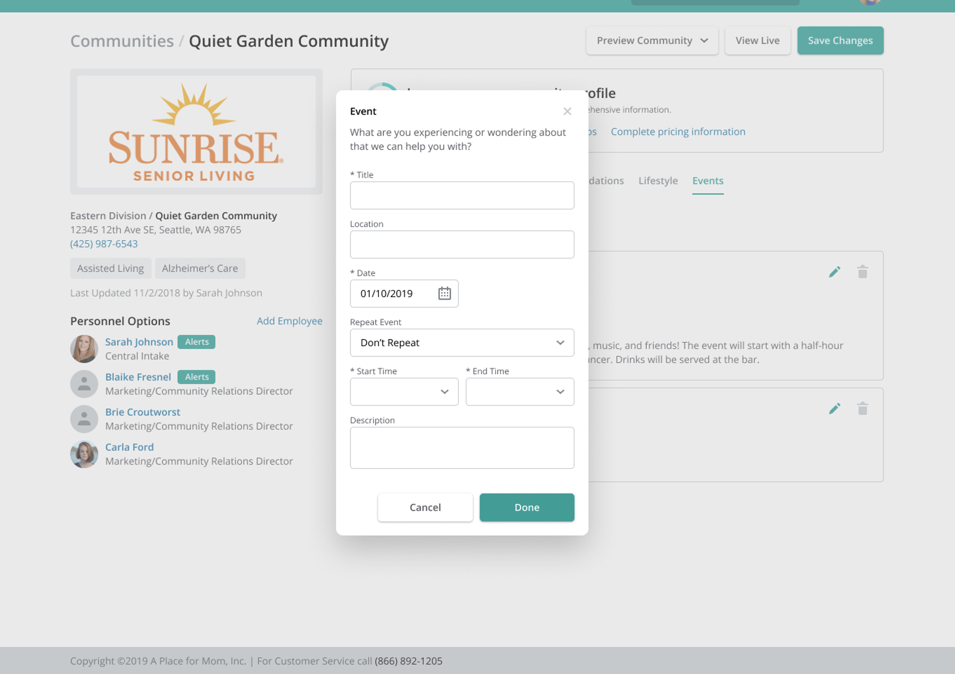
COMMUNITY EVENTS
RUN REPORTS
IMPACTS OF SOME OF MY DECISIONS
EVIDENCE OF SUCCESS
A Place for Mom provides a number of proprietary tools that help families and partner communities connect, coordinate and communicate. By creating a score tool to promote enhanced community profiles, partners are given access to their tools and gives senior living providers a competitive advantage and increase quality move-ins. By partner communities updating their profiles with quality content, we were able to sync their community profile on the APFM website & SeniorAdvisor.com, the nation’s largest senior living ratings and review site. This created multiple channels of visibility for communities.